How to use conditional formatting to visually analyse data, including non-numeric data such as grades, levels and categories.
Visual data analysis is a potent tool for quickly understanding patterns, trends and areas for action. In an educational context, this can be used to track performance over time, or as a comparative tool to highlight achievement in different areas (e.g. subjects or skills).
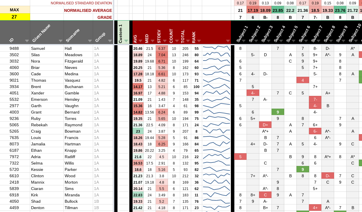
The example google sheet above (populated with random generated test data) is also a generic template that you can use right now to analyse your own data.
Populating with Data
While you might be lucky enough to have purely numerical (continuous) data to analyse, frequently it may be fully discrete (such levels, categories or grades) or a mixture of both types. Building upon the techniques explored in our tutorial on handling grades, this template sheet can handle all data types (discrete, textual and numerical).
Conversion Magic!
Sadly not, but close! If you are analysing non-numerical data like UK 1-9 GCSE Grades or standard A-E grading scales, you need to tell the sheet a little about the type of data you are using. This is done by creating a scale of all possible values in the column, delineated by ‘|’ characters.
| U | G | F | E | D | C | B | A | A* |
This is done by putting these scales in a hidden row at the top of the template sheet. Any column without a scale at the top will be interpreted as a column containing numerical data. If you have data in a column with a scale, the scale must contain all the potential values in the column, otherwise the calculations will fail (e.g. if you are using the grade scale above, don’t include a value such as ‘Z’ that isn’t included in your scale).
You can use the example scales (in the config tab of the template spreadsheet) or customise your own. In order for the scale to work reliably, make sure it ends with a ‘|’ character but doesn’t start with one (e.g. D|C|B|A|). You may also choose to use words / phrases in your scale too, which will work perfectly as well.
| Needs Improvement | Meets | Exceeds | Outstanding |
The various formulas in the template sheet will convert the cell values into numbers before performing calculations on them (such as average, median and stdevp), without you needing to do anything else!
Paste Your Data
There are five main areas of the template sheet, which are listed below. To ‘clear’ the template sheet for first use, select all the cells under the grey and black headed columns, and press delete on your keyboard. All the data will be removed, and calculations will be reset to blanks.
When you paste your own data into the sheet, you should make sure you only paste values (not formats) by using the ‘Paste special -> Paste values only’ menu command, or press ctrl-shift-v. By doing this, you won’t override any of the existing formats or conditional formats.
- The section at the top (above the coloured row) gives summary information about the data in the columns below. You don’t need to touch any of this, apart from the first hidden row, where you should put your scales.
- The columns with grey headers contain metadata about each row, such as the name of person/student and any associated IDs. You don’t have to use all of these columns, but you should paste your class/group list in here!
- Green headers are for columns that are blank for your custom data (such as important scores for each individual, or specific academic information such as learning difficulties). Most of these columns are hidden by default, but feel free to unhide them if you need them or hide them all if you don’t.
- Calculated columns (dark red headers) shouldn’t need to be touched at all. All the formulas in here will spring into life when they see some data to process!
- Data columns have black headers and are where you should paste your results / performance data (such as marks, predictions, exam scores etc.). You can rename the headings to whatever you would like (such as ‘English’, ‘Maths’, ‘January Exam’ etc.).
What else does it do?
Once you have finished pasting your data in the template sheet (into the columns with black, grey or green headers), it will generate summary figures for all your data. At the top of each column will be the aggregated statistics for each column, including:
- Normalised Average: This is the numerical average (mean) of the column, but normalised by the ‘size’ of the scale for each column. This means that this value in each column is comparable with the other columns (regardless of how ‘large’ the scale is for each column). These values are colour coded between red (lowest) and green (highest).
- Normalised Standard Deviation: This is a measure of how varied the data is in the column. It is also normalised according to the size of the scale, so should be used to compare different columns of data. A wide variance of data values (e.g. a spread of values from A-E if you are using grades) will show a higher number here, and a narrow spread (e.g. mostly from A-C) will show a smaller number. Most people would regard a tighter spread (consistent performance) to be a desirable trait, so larger numbers are coloured red here.
- Grade: This is the numerical average converted back into a value from the accompanying column scale. If there is no scale for the column, nothing will be displayed here.
Each row (person) will also have a set of summary figures in the columns with dark red headers. This will include similar an average and standard deviation, which are both normalised and coloured in the same way as the column summaries above. There are also:
- Count: This is the number of values in each row, which is useful for checking that you have the same amount of data points for each individual.
- Total: The numerical total of the values in the row, useful for troubleshooting any unexpected results!
- Median: This is the middle value in the data row. It is helpful because it helps describe the ‘shape’ of the data. If the average is above the median, then the data is skewed towards the higher values (e.g. with a long tail) with the opposite being true if the average is below the median. An average and median that are very similar indicates that the data is normally distributed (e.g. there is approximately the same number of values above and below the median).
- Rank: A measure of where each individual falls within the group/cohort based on their average (a lower number means a high performer).
- Sparkine: The compact line graph for each row is a visual representation of the data. In the case of subject comparisons, it helps show how ‘varied’ the data is (like the standard deviation). If you are analysing data over time, then the sparkline will help show progression over this period and it a straightforward way to identify individuals making expected, higher or lower rates of improvement.
Conditional Formatting
The ability to change the appearance of cells according to rules is a powerful tool for quick data analysis. It is important to use it properly though. Simply colouring cells according to their values is often not the best way to proceed (you’ll end up with a sea of green or red!). The key is to use format to communicate something that isn’t already conveyed by the value.
In the case of our template sheet, indicating whether a value is high or low with colour (over the whole cohort) isn’t much use, as it will merely highlight lower-performing individuals (which is already done by the average column and the rank). It is duplicate information and a waste of our precious bandwidth!
We need something we can visualise and then action, so the template sheet highlights (in red/green) especially low or high values for each row. Our approach immediately shows skills or subjects need attention for each individual.
The template achieves this by comparing the value in each cell to the average for each individual and highlighting it if it is a certain number of standard deviations away from that average. By default, any value that is more than 1.4 standard deviations from the average will be highlighted (although this can be altered as required).
Customising
The template sheet will work straight away, for a large number of rows and columns, so you shouldn’t need to do any further customisation work! If you need to add additional rows, you will need to copy down the formulas in the dark red columns. Add extra columns to the right of the last data column (e.g. before the blank end column). Conditional formats should automatically adjust to include the extra cells.
Rounding Precision
By default, the output summary values are rounded to two decimal places of precision. This can easily be adjusted on the ‘config’ tab, although it is worth considering how precise your source data is before setting this too high.
Trigger Levels
These are set in the last hidden row at the top of the template sheet and labelled high (this is for green) and low (this is for red). If you find you have too many value cells (in the black headed columns) being formatted in a particular colour, slightly increase the appropriate value here. If the opposite is true (too few cells being highlighted) then gradually reduce it until the right number are coloured! The ‘right number’ is up to you, and specific to what you want to achieve. Most people will only want to have a few cells highlighted in each row so that they can target the most important weaknesses or celebrate the clearest strengths. It’s not an absolute; it’s just an indicator of where best to target your efforts, in other words, it is the product of analysis.
Tagged ► Sheet, Google, Training, Education, Markbook, Example
Related ► Google Calendars on the Web (01 Sep 2018), Protecting Data with Google Drive (14 Aug 2018), Dealing with confidential information in schools (24 Jul 2018)